Pantone's 2017 color of the year is Greenery (more specifically, 15-0343). I have a particular soft spot for this color, given that I’m Irish AND a graphic designer! My fondness for green and all that is Irish has only grown stronger since I’ve been away from my home country, and with Paddy’s Day just around the corner, I decided to explore the color a bit more.
There’s no other color that has such a profound connection with a country than green has to Ireland, but contrary to popular belief, Ireland's color of state is actually blue. The color blue was introduced as the color of the Anglo-Irish Order of St. Patrick in the 1780s and is still found in symbols of both the state and the Island; however, it’s not too much of a mystery as to why Ireland has adopted the color green. Anyone who's flown over the Island will quickly realize why it’s known as the Emerald Isle, as you pass over fields wondering if there’s any civilization below at all! However, this beautiful green landscape does come at a price. It rains a ferocious amount! A far cry from sunny San Diego, our summers consist of just slightly warmer rain!
In Ireland, green has been everyone's favorite color at some stage in their life. It’s on the shirts of every national team that comes out of Ireland. It’s chanted in the stands of every sports ground in the country: “Come on you boys in green!" It’s on the ground, on the walls, and around us at all times! This is why the Irish love green—but why do people feel certain ways about other colors, and how is this used in design and marketing?
The Importance of Recognizing Color Association
Color affects us in different ways, for different reasons. Years ago, color helped us distinguish between poisonous and edible plants, detect danger, and even read each other’s emotions, long before spoken language was around.
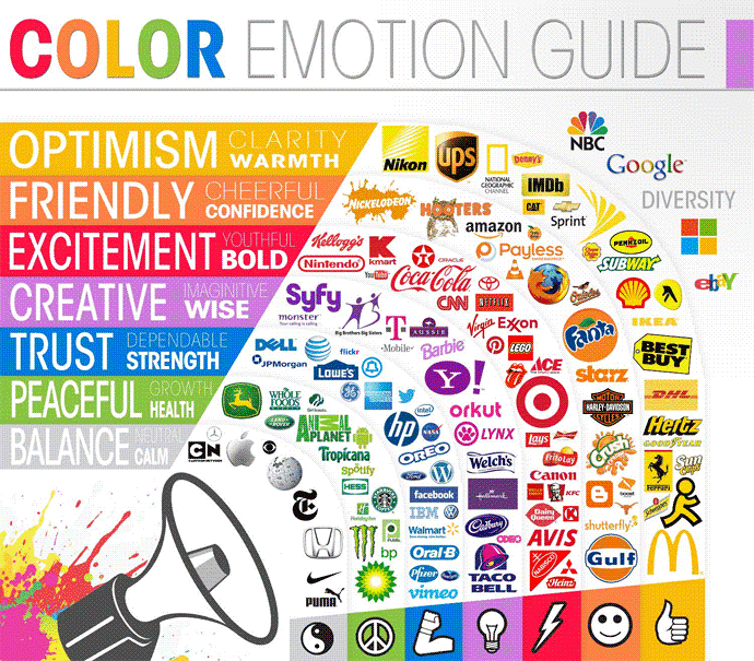
Today, color remains an integral part of our lives. It helps us with crossing the street or finding our car in a crowded parking lot, and holds huge significance in the hearts of patriots. In the modern day, certain colors are given inherent associations: yellow is the color for caution, green the color for "go," and red the color for love. Different tints and shades can also help convey certain emotions; for example, dark blue conveys a sense of security and strength, whereas light blue conveys tranquility.
Although there is no exact framework for how colors make people feel (a lot depends on personal experience), this is a good place to start. In design and marketing, huge emphasis is placed on color theory. In a study titled, “Impact of Color on Marketing,” researchers found that up to 90 percent of snap judgments made about products are based on color alone. This is why it’s so important for companies to associate with the correct color. You can see examples of this everywhere: Banks will often use the color blue for branding as it conveys a sense of security and trust, fast food restaurants often use the color red as it conveys a sense of excitement and impulsiveness, and we are seeing more and more green, conveying health and peacefulness, as the health craze continues to grow.

Source: http://storyism.net/the-psychology-of-colour-in-branding-which-ones-make-you-mad-bad-and-dangerous-to-know/
So What's the Deal with Green?
Pantone certainly categorized Greenery as healthy and peaceful when choosing it as their color of the year. Executive Director of the Pantone Color Institute, Leatrice Eiseman, sums up the choice: “Greenery bursts forth in 2017 to provide us with the reassurance we yearn for amid a tumultuous social and political environment. Satisfying our growing desire to rejuvenate and revitalize, Greenery symbolizes the reconnection we seek with nature, one another and a larger purpose.” Greenery seems like a good fit for 2017, as Leatrice gives a subtle nod to the eventful politics of 2016 and looks forward to a more easy-going, Kumbaya year ahead.
Greenery in Application
Greenery has surely blossomed across web design and has grown in popularity with brands hoping to capitalize on its positive, peaceful association. As nature's neutral color, this theme has had no trouble rising to prominence.
Earlier, I mentioned banks to highlight the use of the color blue for branding with a sense of security and trust. For application's sake, let's say a bank decides to unveil a new online platform to promote the use of paperless statements. This would be an excellent venue to introduce green accents: while a deep blue declares trust, the incorporation of subtle green elements conveys a sense of duty to the environment while promoting themes of growth and health.
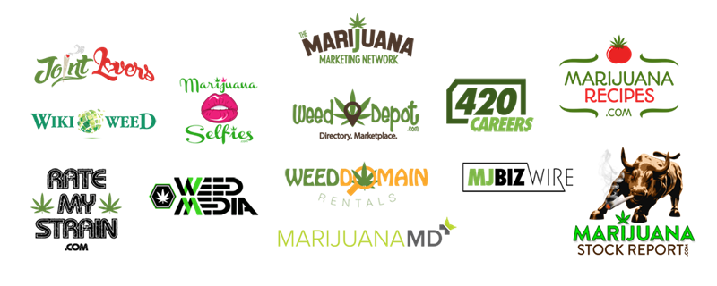
The marijuana industry has also welcomed the color green with open arms, for obvious reasons. Color theory states that green elicits feelings of harmony, freshness, and healing. This association, along with green being the main color of the product itself, seems like a match made in heaven. But because of this perfect pairing, the marijuana game has become overly saturated with the color, making it very hard to stand out. This creates a tough situation when developing a brand—green has a direct association with the product, so you almost have to include it, but you don’t want to blend in with the crowd. One way to stand out is to determine what differentiates you from the competition, and then highlight that feature instead. You can see below that “Marijuana Recipes” uses the color red to highlight their unique selling point. It’s simple, eye-catching, and stands out.

Source: http://www.northsightcapital.com/
As St. Patrick's Day certainly draws a significant amount of attention to everyone's new favorite color, it doesn't look like this green theme is slowing down any time soon. Even if green doesn't quite stand the test of time, rest assured that it will certainly always hold a place in this Irish man’s heart.
Where's the most interesting place you've seen green show up lately? Tweet us @Reddoor to tell us where else you've noticed this trend or where you see it going next!
