In today’s vast digital landscape, email remains one of the most effective and preferred ways for many customers to hear from companies. According to Campaign Monitor, email has had the highest ROI for ten years in a row. Even so, companies are missing out on potential customers and revenue by failing to incorporate accessibility best practices into their marketing campaigns and email designs. In this blog post, we will cover how to make our email designs and email code more accessible to users with and without disabilities.
For a refresher on why accessibility matters, check out our recent blog post on why accessibility is essential to your business.
How to Design an Accessible Email
Designing an accessible email starts with leveraging inclusive design principles along with understanding how our design decisions affect users with disabilities. We will explore multiple ways of making our designs more accessible to people with disabilities and address many common accessibility barriers based off the Web Content Accessibility Guidelines (WCAG 2.1) seen in email today.
#1: Images of Text
Images of text are images that do not contain live text but rather include text as a part of the actual image. Some accessibility issues with images of text include:
-
Readability issues: images of text do not scale or reflow well on smaller devices causing the text to become too small or too blurry on larger devices when zoomed in. This issue is compounded when font size is too small, fonts are too thin, or insufficient color contrast exists between the text and background.
-
Inaccessible alt text: If information is contained in the image and no alt text is provided in the code, important or critical information will be inaccessible to assistive technology users or users who have images disabled altogether. Examples of important information may include dates, times, addresses, phone numbers, or other important call to actions.
-
Inability to take advantage of important device functionality and accessibility features: Most smart devices have baked in click-to-call functionality, GPS and map search based off addresses, and add to calendar functionality to name a few. When important details are a part of images vs actual text, users with and without disabilities are unable to take advantage of these features.
What to avoid when combining images & text:

Images via Really Good Emails
Here are examples of missed opportunities from Public Rec and Patagonia. Key details such as shopping perks and campaign dates are included in an image (vs. live text) resulting in very small and difficult to read text for sighted and vision impaired customers.
5 Best Practices to consider if we must use images of text:
-
Ensure there is enough color contrast between the text and image background
-
Ensure a large enough font size is used so that it scales well
-
Do not use images of text for important information
-
Always provide an image alt text.
-
Do not use GIFs: as a best practice, it is best to avoid email GIFs. In fact, a recent Nielson Norman study found that “on average, people have a more positive reaction to emails without animated GIFs compared to those with animated GIFs.” Additionally, not all email clients support GIFs. This results in some email clients only displaying the first frame of the GIF. When information is provided in subsequent frames, this information will not display. Lastly, flashing content may be disorienting and distracting to some users with cognitive disabilities. Ensuring users have enough time to read content is also important for accessibility and conversions.
How to correctly use text & image in an email:

Images via Really Good Emails
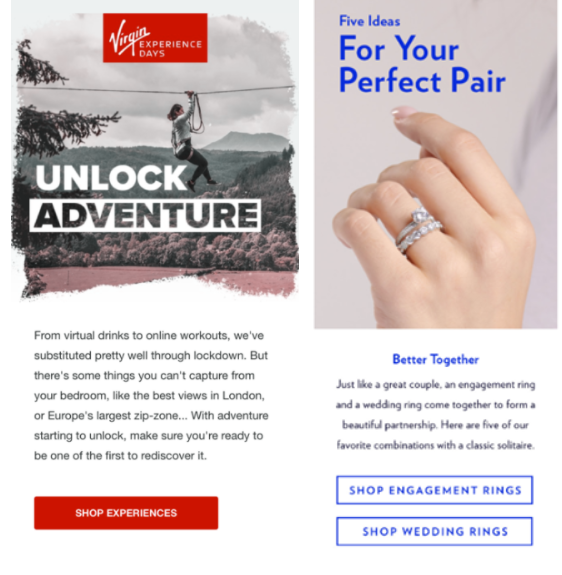
Here are examples showing Virgin and Blue Nile incorporating image of text best practices: large text for scalability, sufficient color contrast between text and background, and exclusion of important information in the actual image.
Key Takeaway: In general, it is best to avoid images of text where possible.
#2: Color Contrast and Use of Color
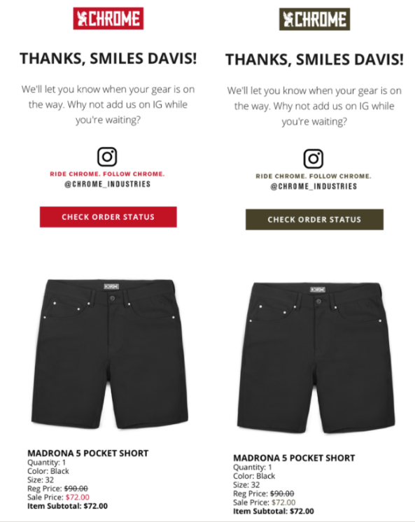
It is important to make sure that use of color is not the only means used to convey important information. As an example, consider an eCommerce email that is highlighting a current sale. The email displays a product image and sale price. The sale price color is indicated by red. Users with color blindness may be unable to perceive the price as a sale price because it relies on the use of color alone. Instead, use a combination of font typeface styles such as a strikethrough text treatment for old prices and a visible “Sale Price” label for new, lowered prices. As another example, when highlighting a featured product and colors available for a product, do not rely on a color swatch alone. Always add a visible color label that informs the user what colors are available.

Images via Really Good Emails
Here is an example of an email with sufficient color contrast and use of color by Chrome Industries. On the left we see the original email. On the right we see the same email consumed by a customer with color blindness. A color-blind customer can understand and perceive the total savings for their purchase easily due to the use of labels, strikethrough pricing, and other font treatments.
Key Takeaway: Ensuringall text and other controls such as links and buttons contain enough color contrast between the text and background is critical for users with moderately low vision.
#3: Copy and Information Hierarchy
When it comes to information hierarchy and copy, sticking to fundamental design methodologies is your best bet. Some dos and don’ts include:
-
Making sure the organization and layout of the email design is logical and easy to understand. · Providing clear, concise, and easy to read copy: check out Readable testing to see what your readability score is.
-
Avoid centering text as users with cognitive disabilities such as Dyslexia have increased difficulty understanding content that is center aligned. As a rule of thumb, avoid large walls of text and opt for smaller paragraphs with headings.
-
Make links visually distinct inside large bodies of text.
-
Use a 14px font size minimum. Avoid fonts that are too thin.
-
Ensure all links are descriptive and avoid generic or ambiguous link text such as “read more” or “click here.” The copy of links should communicate context on their own.
-
Use big enough calls-to-action and utilize white space appropriately.
-
Always use a good balance of images to text. As a rule of thumb, use the 60/40 rule. 60% to images, 40% to text.
-
Provide appropriate alt text for images – unless an image is purely decorative, all images should have alt text. However, determining the function and correct alt text can be complicated. This Alt Decision Tree helps copywriters determine what the best alt text for images should be.
How to Develop an Accessible Email with a 10-step Checklist
Designing an accessible email is only a part of the solution as developers must also incorporate accessibility best practices into the HTML code. When it comes to developing emails, developers must use table-based layouts to achieve optimal rendering and compatibility across different email clients. As a result, we lose semantic meaning. Below are some HTML best practices to ensure email code is as accessible as possible.
-
Build responsive emails: making emails responsive allows users to access the most device friendly and scalable version of the email.
-
Always specify a language attribute: the language attribute is used to identify the language of text in the email.
-
Specify a page title: the page title appears in the browser title bar.
-
Text alternative: always provide image alt text unless the image is decorative.
-
Clickable links and buttons: ensure controls such as buttons are coded so that their entire surface area is clickable.
-
Style alt text: when images are disabled, alt text is shown to the user. Styling the alt text and providing enough color contrast between the text and background makes the text more accessible to users with vision impairments.
-
Validate the HTML code: let’s face it, working with tables (and nested tables to boot) can be a tedious job. Missing an ending closing tag or a tag typo can easily happen so it’s important to always validate your HTML code. To test your code, try out this markup validation service or this accessible email validator.
-
Tabular information: unless tabular information is being presented in the email, ALL tables should always be marked with role=”presentation” – this informs assistive technology that the content should not be read or interpreted as tabular information. Most, if not all the time, this is the case.
-
Title attribute: Do not use the title attribute on links. Inconsistency among assistive technologies makes this attribute unreliable. Instead, ensure link text is descriptive.
-
Plain-text version: If your email service provider allows it, always include a plain-text version of the email.
Time to Employ Email Accessibility Best Practices
Now that you understand the best practices of designing and developing an email with accessibility in mind, you will be able to expand your readership and take advantage of the most effective digital marketing channel out there.
If you would like to learn more about the email marketing capabilities of our team, and understand how we can help further increase engagement and overall performance of this crucial channel, contact our team to schedule a call today.
