In its simplest terms, "mobile-first" means designing an online experience for mobile before designing it for desktop, tablet, or any other device. E-mail design in particular, differs from traditional web design in many aspects. In today's consumer landscape, a mobile-first approach ensures that we are meeting consumers wherever they are: the gym, the grocery store, in line waiting to order lunch, or the hallway between business meetings. Although tailoring e-mail design depends on the individual needs of your audience, here are some best practices to help you get started.
Design With Purpose
Before starting a design, it's important to have a clear understanding of your audience and the purpose of your e-mail. Although there are many different kinds of e-mails, generally speaking, they fall within one of three categories: Read Me, Buy Me, and Join Me. Each of these categories has its own set of best practices. Knowing the purpose of your e-mail will inform its content and design. If you are unsure of your audience or the e-mail's purpose, work with your team to come up with a mobile-first strategy.
Design Mobile-first
Recent studies show that 41% of e-mails are opened on a mobile device, and 75% of smartphone users delete e-mails they can't read on their mobile devices. However, designing mobile-first often seems to be easier said than done. A common mistake is to design an e-mail as you would a landing page. Remember, simplicity is important. Typically, the shorter your e-mail, the better it will perform. For e-mail designers, having some basic knowledge of the limitations of developing e-mails is beneficial. It is helpful to work with your developers and ask questions for additional insight.
Best practices for designing mobile first e-mails:
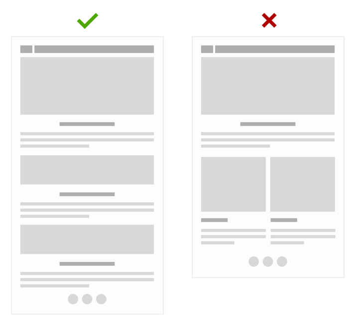
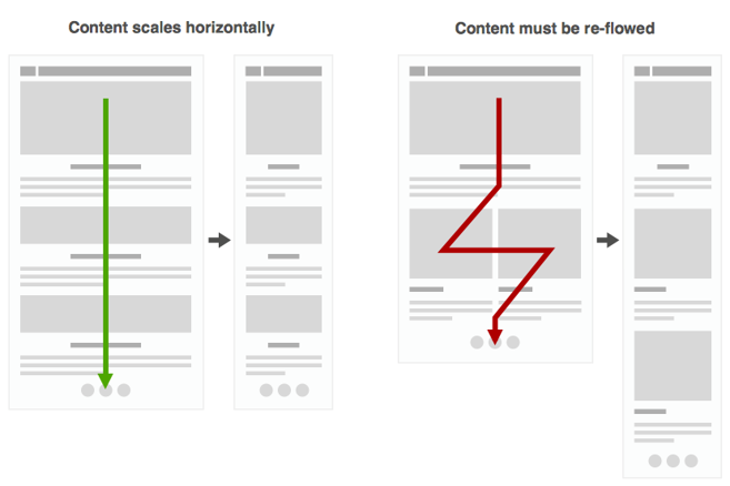
- Use a single column design. In single column design, the content flows downward rather than both, downward and side-by-side. (tweet this tip!)
- Create an information hierarchy. Keep the most important information above the fold. Information secondary to the e-mail's main purpose should always come after the e-mail's main content and Call to Actions (CTA's).
- Streamline content so that it is scannable while avoiding clutter.
- Use larger font sizes and web-safe / system fonts. Check out this list for more information on typography in e-mail.
- Make sure CTA's are touch-friendly.
- Link CTA's to mobile friendly Web pages - think beyond the click.
- Avoid full-blown navigation bars (remember, this is not a landing page).
- Use plenty of negative space. This increases mobile readability

Mobile-first vs. Mobile-Optimized
Essentially, the biggest difference between mobile-first (single-column design) and mobile optimized (multi-column design) e-mails is the flow of content. In a single-column design, the content flows downward rather than both, downward and side-by-side, eliminating the need for media queries. This ensures that the e-mail is consistent in all mobile e-mail clients in both portrait and landscape views. Multi-column design usually requires a blend of responsive and adaptive design (in addition to separate mobile and desktop e-mail designs) to achieve a mobile friendly e-mail. Responsive design uses device breakpoints (media queries) to reflow content, while adaptive design uses percentages to achieve a fluid grid. Not all e-mail clients are created equal, and there is no perfect solution for achieving a mobile-optimized e-mail. Having a mobile first e-mail strategy, knowing your audience and the purpose of the e-mail, will help to inform your decision about which route to take.

Sources and Additional Reading:
Is Responsive Design Really Effective?
Email trends report: mobile vs. desktop
Anatomy of a Mobile Email
Mobile First: What Does It Mean?
The Ultimate Mobile Email Statistics Overview
Responsive HTML Emails: A Different Strategy
iOs Human Interface Guidelines
